Amidst a handful of controversies, protests and rumors of an upcoming IPO, Reddit has unveiled a shiny new brand designed by Pentagram. Naturally, a rebranding of "the heart of the internet" comes with a flurry of hot takes from every perspective imaginable. So here I am to add a little fuel to that fire.
I've always respected Pentagram's work. They're a very creative bunch and always bring unique solutions to large and complex projects. It's easy for companies to play it safe when they're serving a national or global audience, and it takes strong convictions and solid research to present something unique at that level. This Reddit rebrand shows signs of that Pentagram ethos, and I think they've done a great job. However, I feel like the underlying goals of this rebrand are preventing it from being a truly successful effort. To get there, I want to talk a bit about design philosophy. First, we'll work our way up to that by looking at the new brand.
Reddit has always been a wild place. At times, it was a bit lawless, but primarily I believe the ragtag culture and aesthetic comes from a focus on function before form. (This is where true redditors respond: "BuT tHe SiTe DoEsN't FuNcTiOn! [sic]". I know; I struggle to doom scroll sometimes too.) Reddit has always looked like it was designed by coders, with its marker for subreddits "r/" being a prime example. Through years of users associating that aesthetic with their connection to like-minded people, those simple elements became something valuable to the brand and its users. On the flip side, that investment in the existing brand is not something they'll easily part with. So far, it appears Pentagram did a great job working within that minefield.
"Snoo"
I think this was Pentagram's strongest tool to appease the swarms of keyboard warriors that flock to any major rebrand. To a great extent, it seems to have worked.
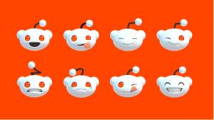
Reddit's red-eyed alien is easily the most iconic element, and who doesn't like a cute little character? The 3D redesign gives much more life to Snoo and opens up a wide range of possibilities for more meaningful brand interactions. Giving people something they connect with on a deep enough level to become their favorite shirt, go-to reaction gif, or a desk toy they stare at when avoiding work can be a powerful tool for a cultural brand like Reddit. To quote a fellow VI designer working on the Oklahoma Fishing Trail brand: "Will it hat?" In this case, I think so.
Typography
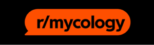
This is Pentagram's bread and butter, so it's no surprise the custom typography is great. The new display typeface has simple word bubble icons incorporated throughout. In the logo, those word bubbles in the counter forms of the d's help to connect the wordmark to the icon. It's clever and helps inform the brand visuals, but it's not what elevates this brand. More importantly, I think they've respected the typographic roots and unique vocabulary of Reddit's brand. For example, the "r/" is modified slightly to become a simple, purposeful and satisfying symbol that ties the entire site together. When you're a community of nearly 20% of the world's population, maintaining a strong, shared visual language is a top priority. That unified language is something built organically over time, not something a room full of designers and executives can dictate... Ahem... X.
Iconography
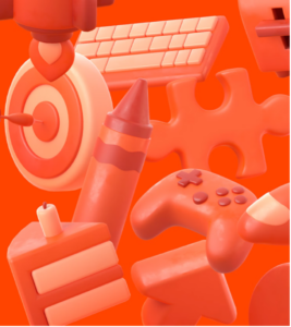
One element that I feel is largely underrepresented in the new brand is the up arrow, or "updoot." It's a very simple and common shape, but one Reddit has largely owned in the social media space. It's a bit more rounded than before in the Reddit UI, but hasn't changed much beyond that. In advertising applications, it got the 3D treatment along with a collection of icons that broadly represent the community. It's early in the brand rollout, but so far the way these icons are treated is a little lackluster.
This brings me to my main criticism. For such a vibrant community, the representation of that personality within the brand seems to be lacking. It seems like all the rough edges have been polished, leaving this feeling more like Instagram than Reddit. Perhaps that reflects an internal push to simplify Reddit's message to reach new audiences. I can only speculate on the underlying motivations.
Now for the philosophy I promised earlier.
One of my favorite rebrands was Mozilla. When Mozilla rebranded, they opened the process up for a conversation with their community. They shared elements from many steps in the design process as well as the concepts and goals that go into the company's identity. Every step of the way, their community got more invested, and in turn, Mozilla made sure the community felt heard. Importantly, this wasn't a case of design by committee. These conversations essentially became a valuable research tool in the design process. This approach strengthened the new brand among its existing user base, and the resulting conversations pulled in a new audience who quickly became invested too. In the end, Mozilla felt like the community it represented because it made a meaningful connection with them. It wasn't a new coat of paint to freshen up the look. It was a chance to understand and strengthen what the company and community already were. Notice, I haven't described the Mozilla logo at all in this. The shapes and colors are just a logical conclusion to this process. A good designer can make you an effective logo, but it takes a community to create a successful brand.
Reddit has an engaged user base at its fingertips but didn't involve them in this redesign. I think it shows that Reddit designed this primarily to appeal to investors for its rumored IPO. Pentagram did a great job with the directive they were given, but the mixed priorities of Reddit left "the heart of the internet" with no soul.
Odds are you're not one of the roughly 12 people that run a global tech empire, so I want to rephrase my point to fit the rest of us. Whether you're a regional fast-food chain or an organization advocating for public health, you've built an audience that's invested in you. Creating a brand with them, whatever that looks like, is the best way to create a truly successful image for yourself.